Overview
Lemobs is a GovTech that is part of the innovation ecosystem present in the UFRJ Technological Park and has as its mission to make cities smart through the use of innovative technologies. One of its main products, the Sigelu platform, has several modules to facilitate and streamline public service through its digital solutions.
Due to the large number of products offered and the continuous growth of the company, the creation of a Design System was necessary. This internal product has sets of standards for interfaces, usage principles, and component documentation to certify the quality among the company's products and speed up development processes.
Problems
- Inconsistency of visual patterns and behaviors in the systems;
- Lack of communication between business and development teams;
- Excessive runtime for prototyping and screen development.
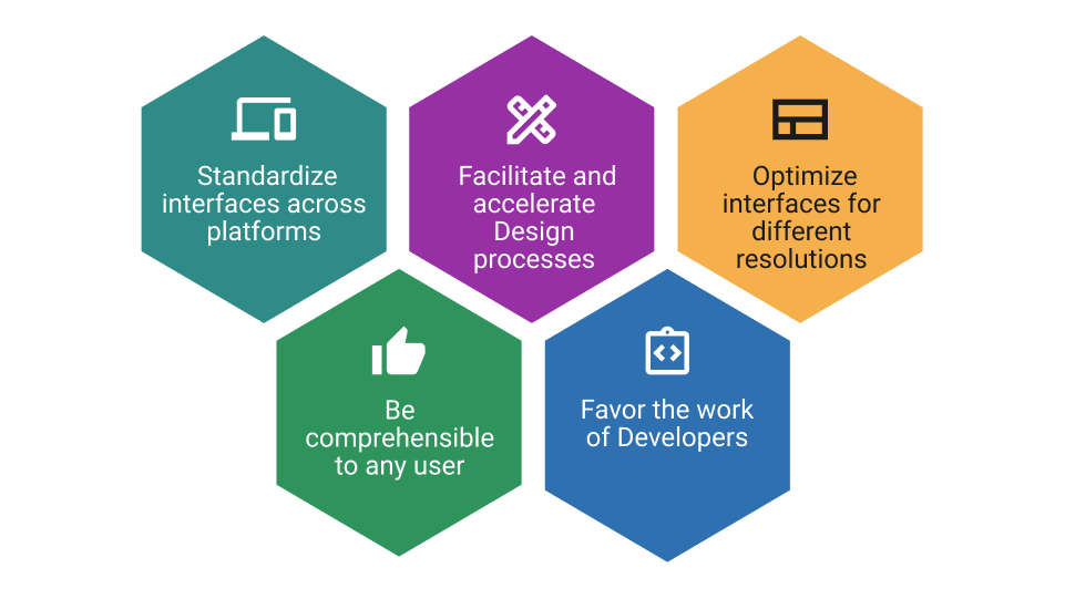
Goals
Challenges
- Several programming languages and standards in the system;
- Create the Design System in parallel with the usual demands of the different products;
- Few people in the Design team;
- Several products and modules to apply the Design System.
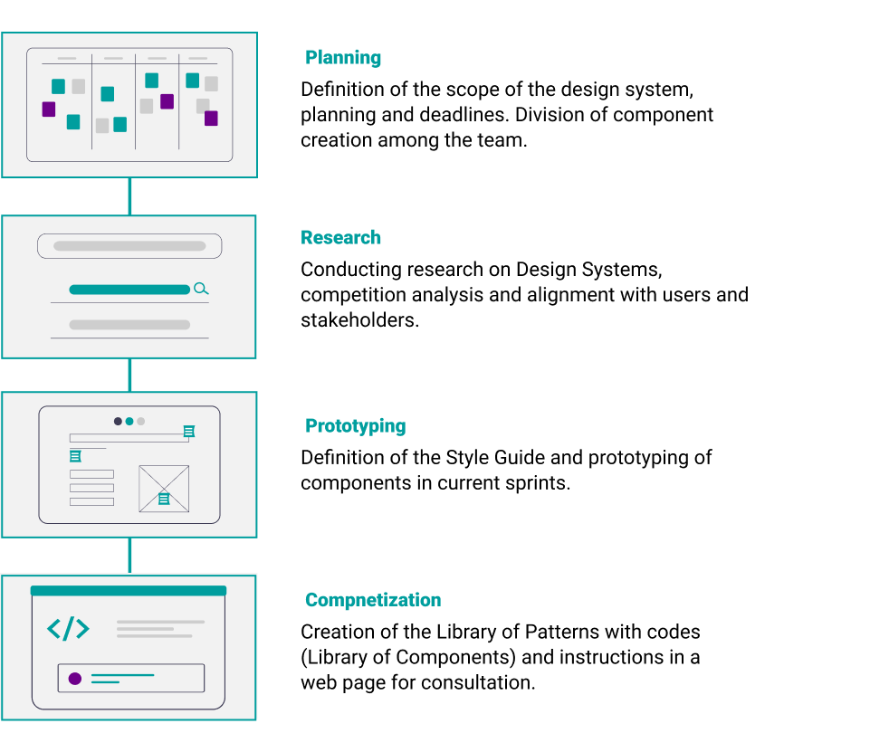
The Process
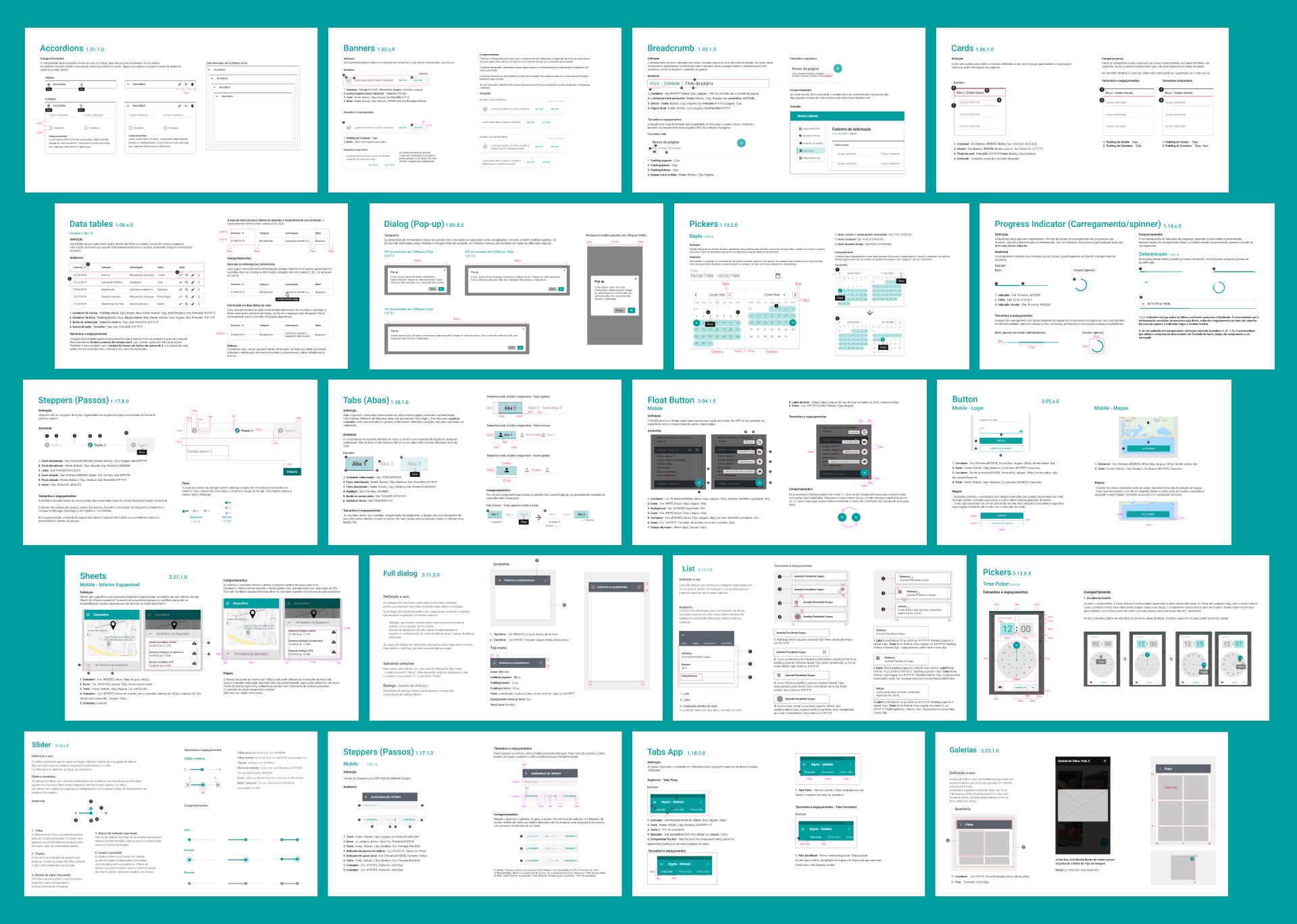
Scope

Components
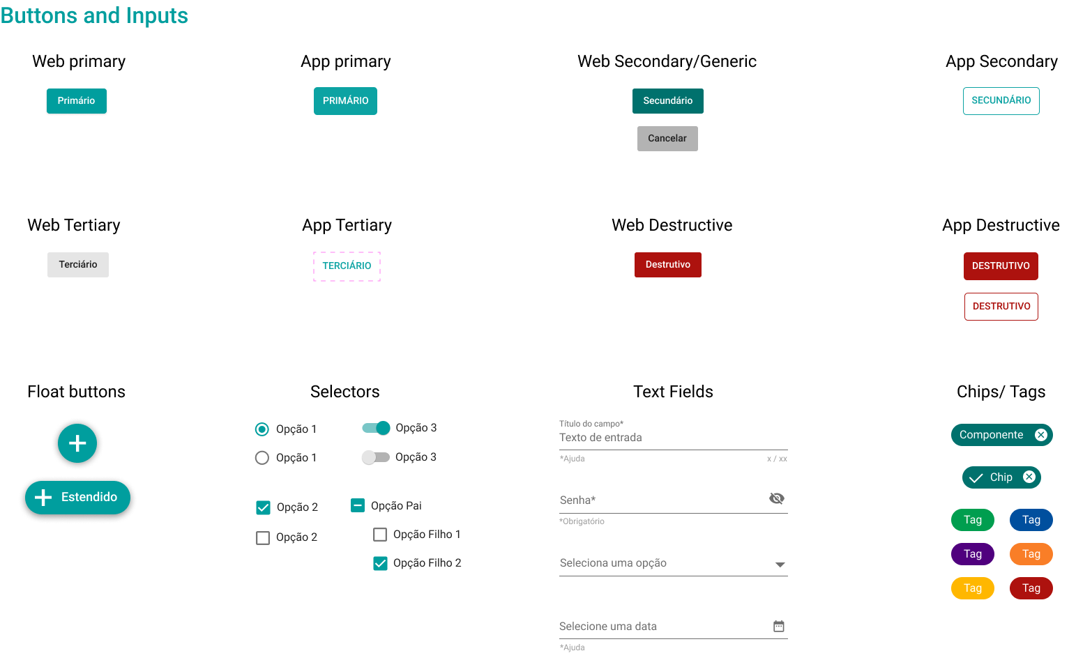
And much more...
Impact
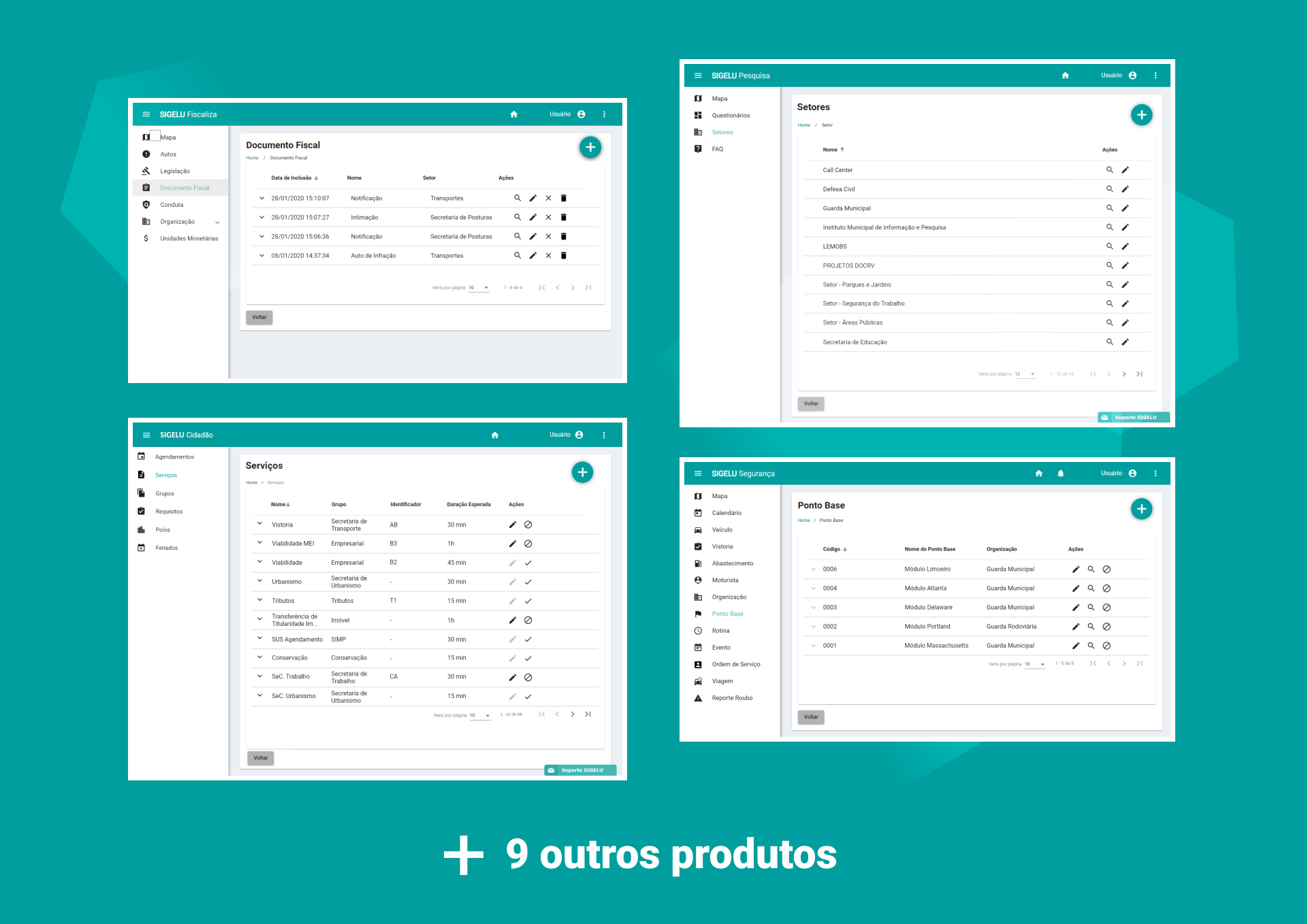
Modernization of interfaces

↑ O design system permitiu modernizar e padronizar diversos aspectos do produto.
- Application of contrasting and harmonious brand colors;
- Single font family (Roboto);
- Concatenated information per entry;
- Clear and simplified actions and icons.
Visual unity for different product modules
Responsive interfaces
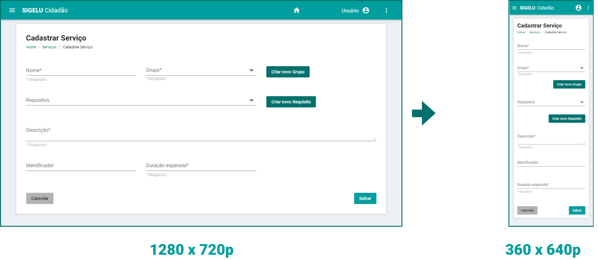
↑ All components and other elements were designed with accessibility in mind.
Streamlining Design and Development Processes
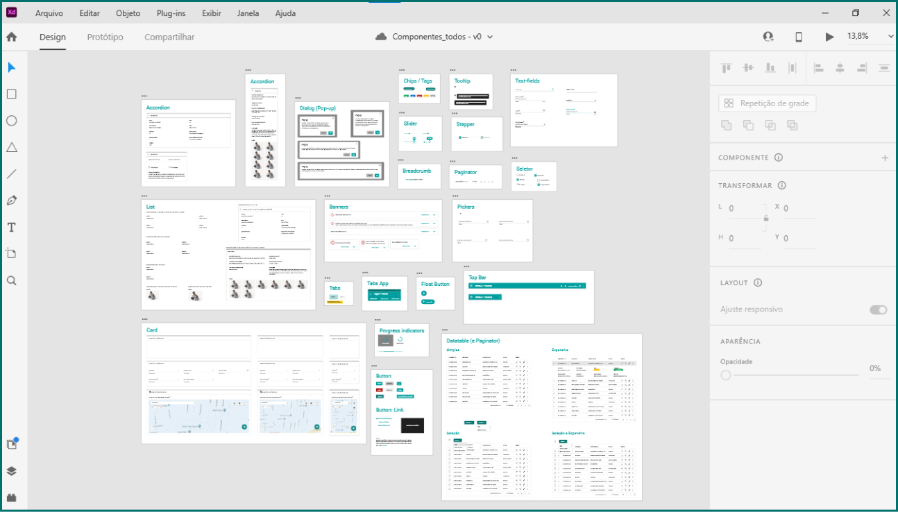
↑ A library of interactive and animated components has been created.
All components were created in the Adobe XD program, in order to facilitate their reuse by the Design team.
These elements were composed in different states, with predefined interactions and animations to speed up prototyping and input for the business and development teams.
Reduced demands for simple screens
The definition of the Style Guide and the Component Library made it possible to create templates for simpler screens. These templates optimize the time of the Design team, which can focus on complex demands, while providing developers with autonomy and guidance for producing new screens in the system.
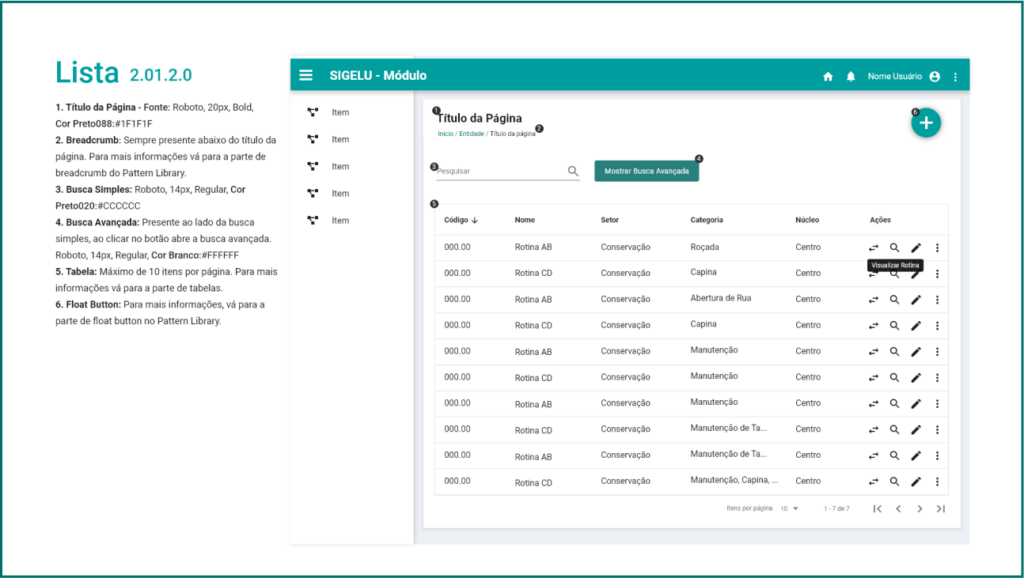
↑ Exemplo da documentação de um template de lista.