Overview
After a major rebranding project and updating the company's visual identity, several points of contact of the brand with the public needed to be updated for the new communication proposal.
The Problem
Apply the new communication concepts, defined in the new brand, and also solve design problems that already existed in the previous version.
An institutional site is usually one of the first impressions of the public with the company, so it needs to be always up to date following the most modern standards of performance and security.
Goals
- Strengthen the company's communication, helping to convey more confidence.
- To be a easy channel of access to the company.
- Follow up on internal modernization processes.
- It helps to expand the possibilities when it comes to content.
The Process

Research and conceptualization
With the objectives in hand, research and analysis was done on the existing site, and the main conceptual points were defined.
Previous Website Analysis

Besides the lack of alignment with the new communication guidelines, the previous site had a few problems, the two most important being:
- Use of images and illustrations with little meaning
- Little emphasis on the presentation of the main products offered.
Conceptual Principles
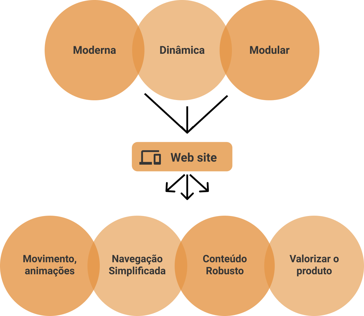
The conceptual principles used to guide the project are the same as those used in the conceptualization of the brand, bringing the same DNA, and thus also a greater conceptual unity overall.
These pillars were inserted into the context of the project, so adaptations were made, so that the practical meaning of each concept could be transposed as best as possible to the web environment.
Information Architecture
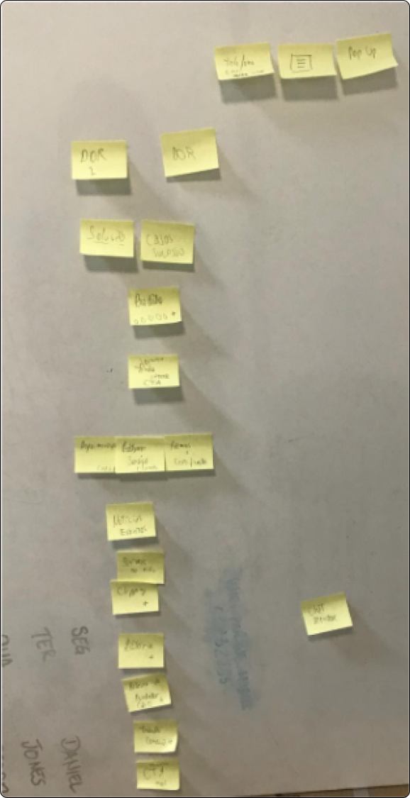
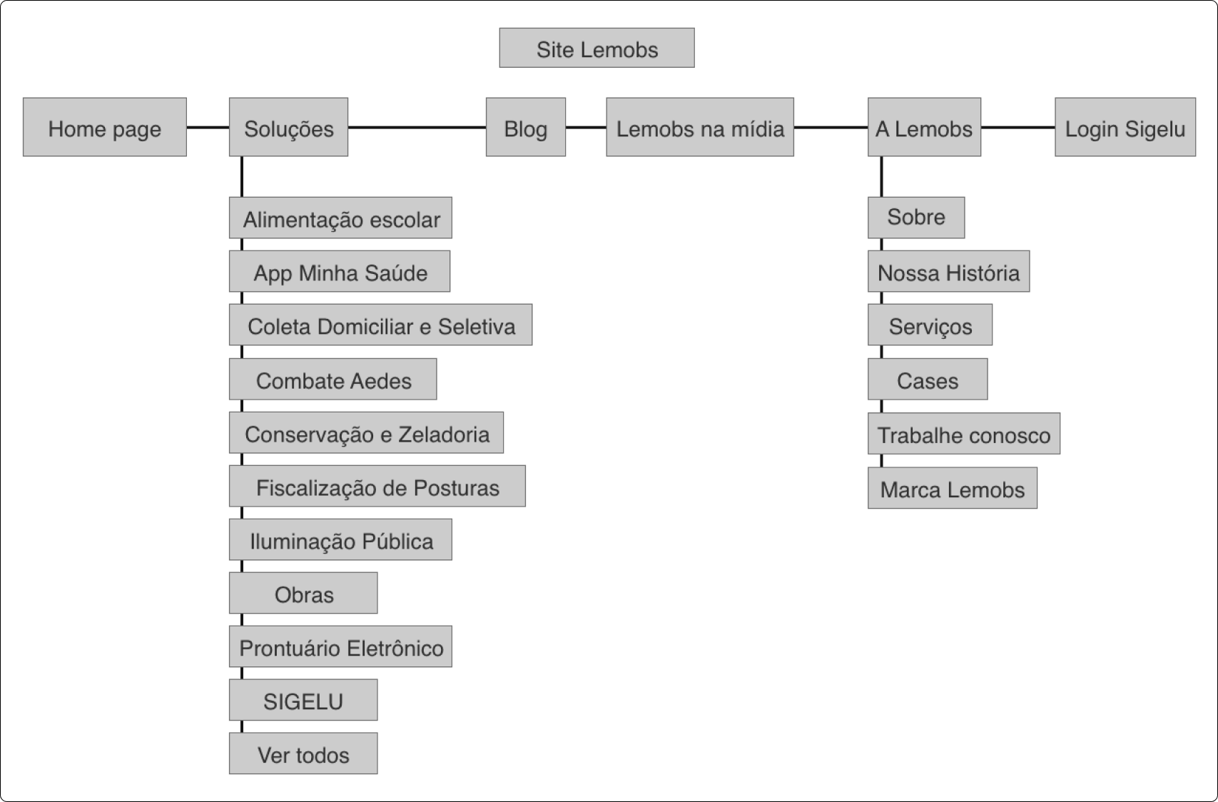
A series of meetings were conducted with experts from other areas such as the communication team, business, marketing, human resources, and customer service. The participation of everyone was crucial to give a more plural and holistic vision for what the site would need to offer in terms of information and organization.
So studies and experiments were conducted on what and how the information should be laid out.
Wireframes
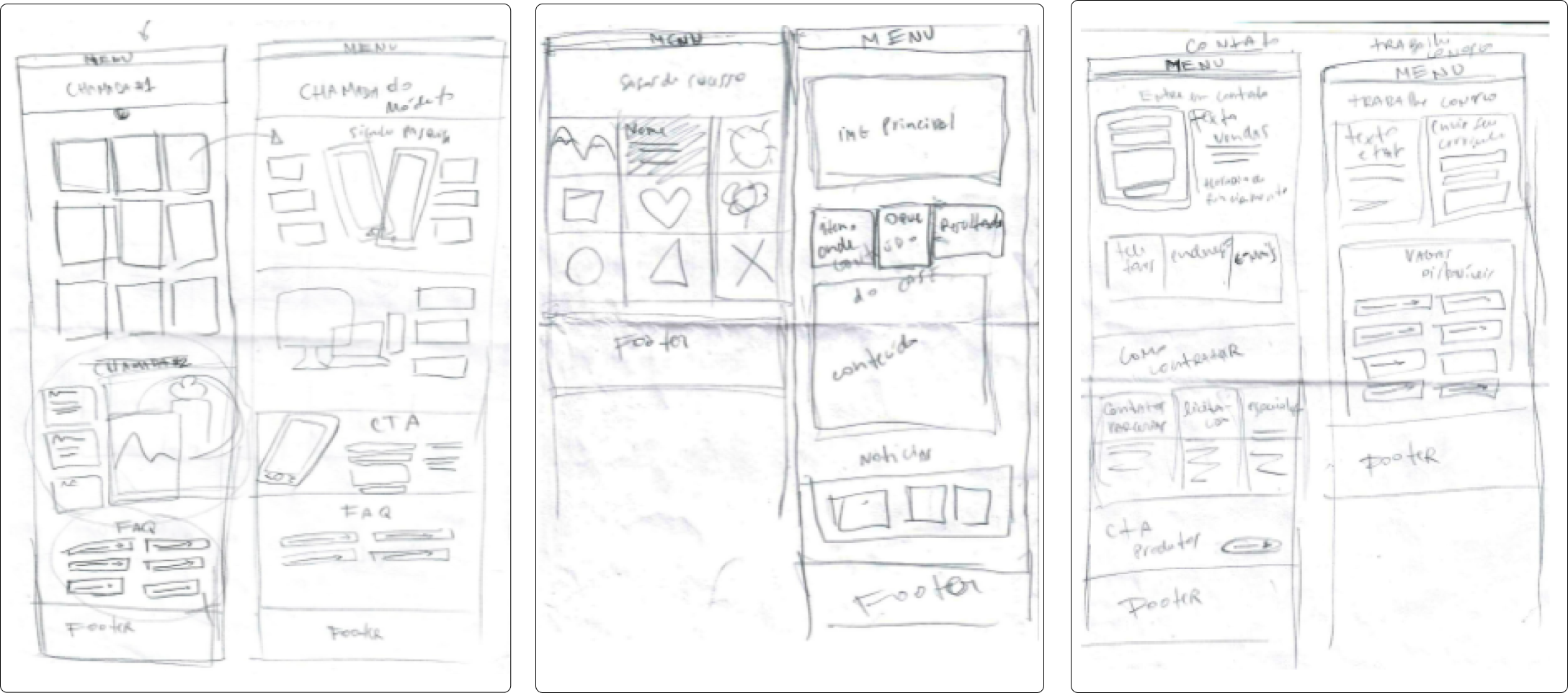
Some primary drafts from the early stages of the ideation process
Low fidelity prototypes
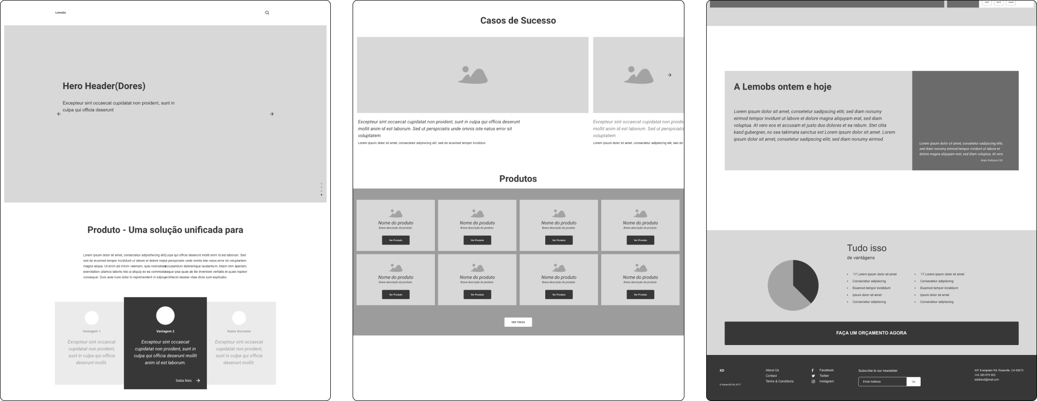
Before the interface refinement phase, I made some low fidelity screenshots to organize my ideas
Design
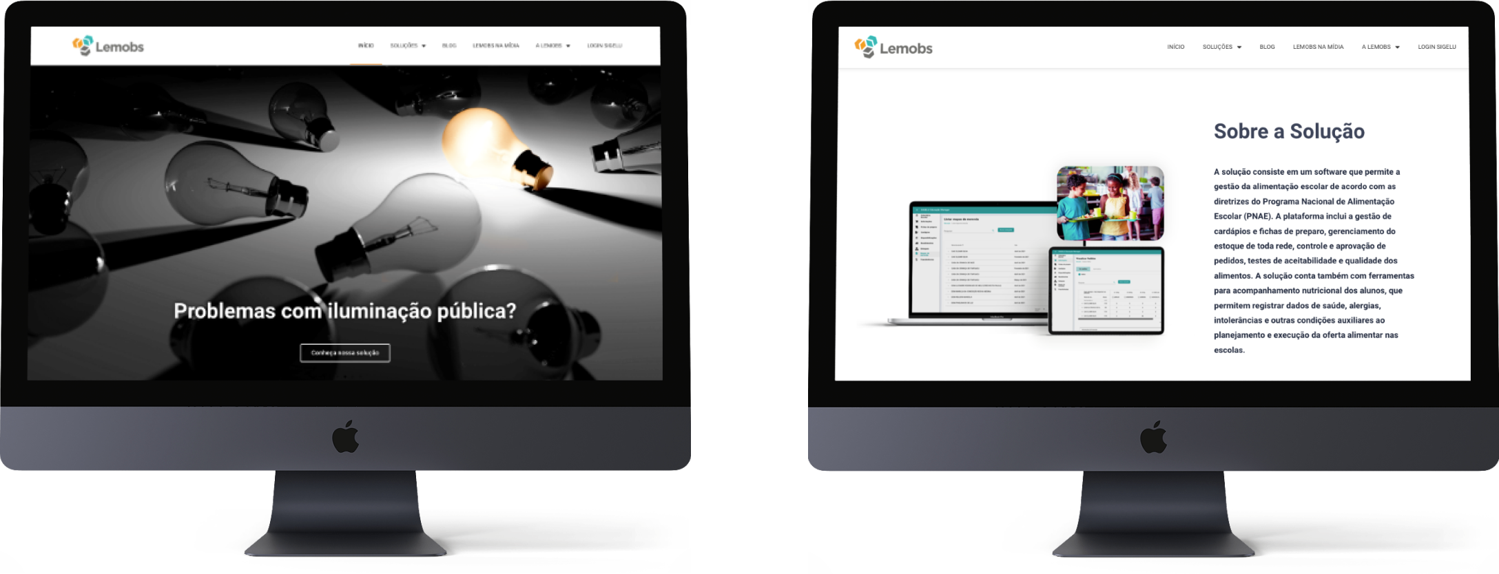
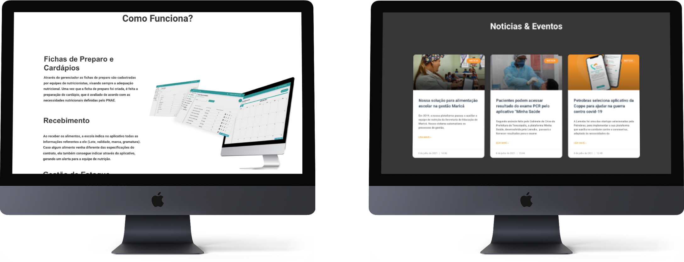
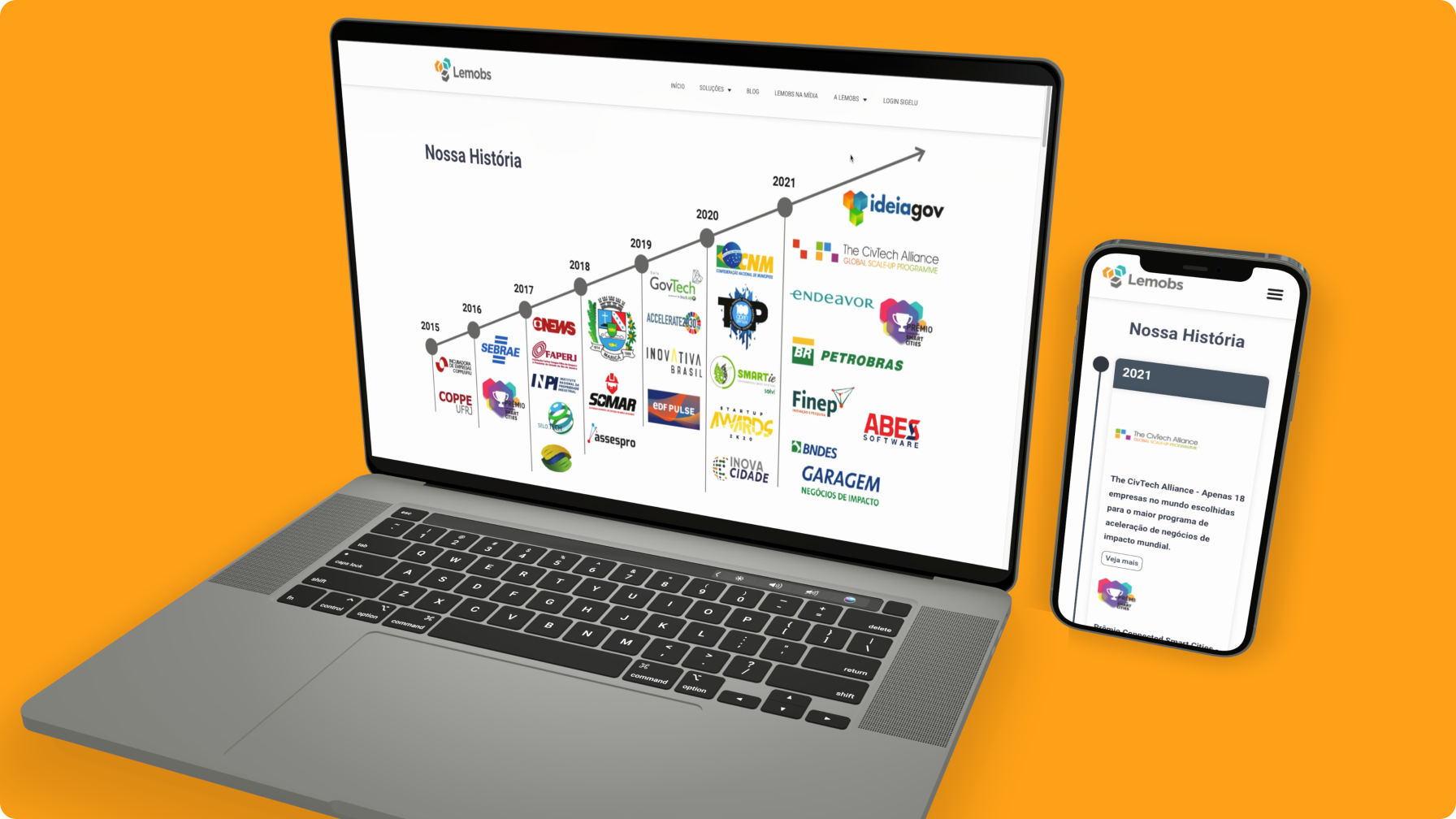
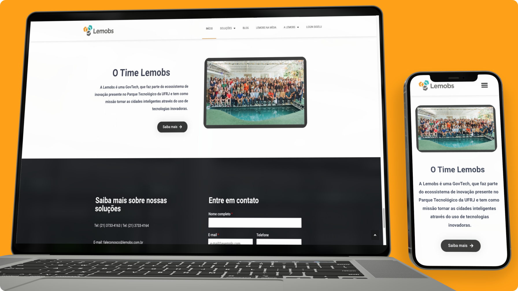
Presentation
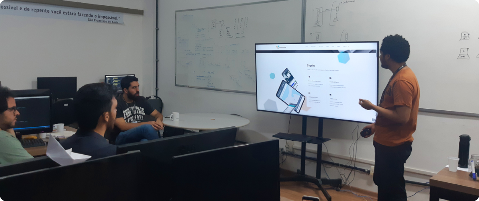
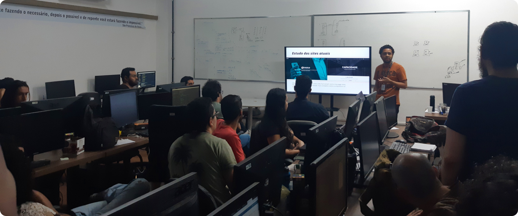
Finally, after all the steps of implementation, testing and revisions the site was officially launched and presented to the other collaborators. In the presentation I showed a little of the process, explained each choice, and showed the new functions of the site.
